Popup alert in Swift
As mentioned in the other article: Popup Custom View in UIKit:
popup mainly can be:
- popup an alert using UIAlertController
- popup action sheet using UIAlertController. For more details, check this: Present action sheet in UIKit and SwiftUI
- popup a custom view/viewController
A popup dialog is a component that displays a modal window with a message or a form to the user. Here is how in both UIKit and SwiftUI.
UIKit
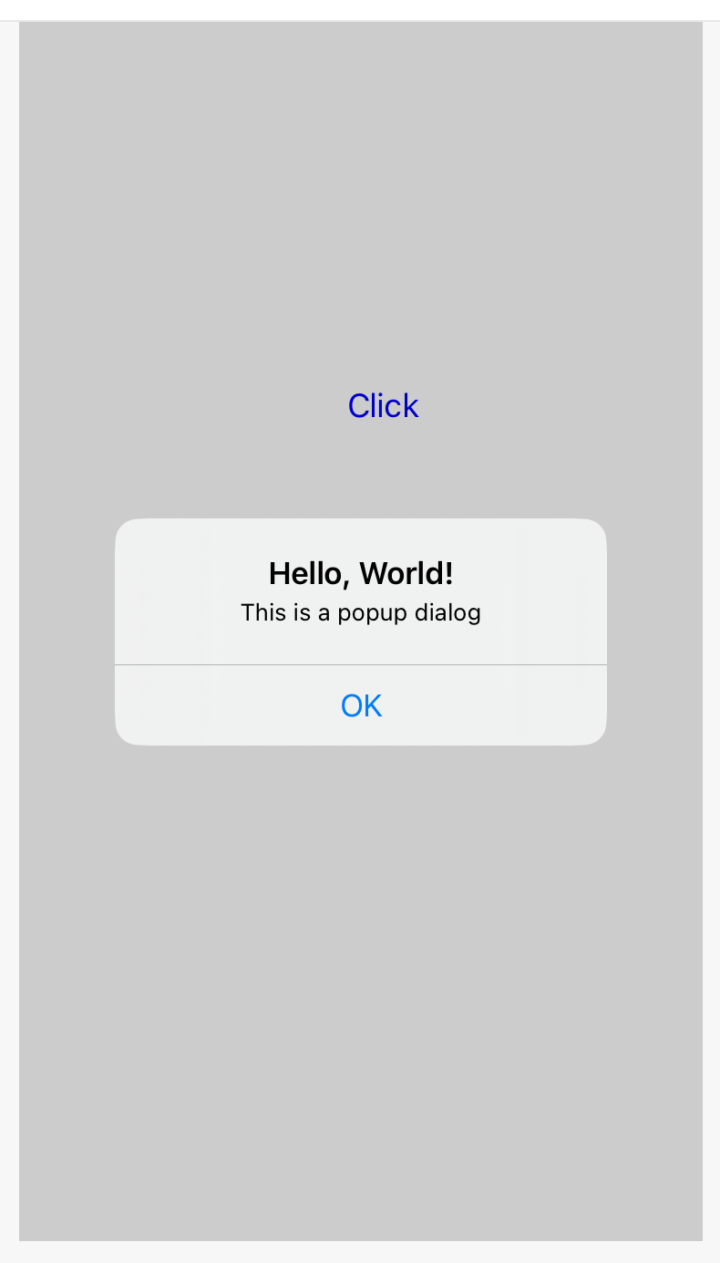
In iOS, you can create a popup dialog using a UIAlertController with the .alert style.
Here is an example of how to create a popup dialog in Swift:
let popup = UIAlertController(title: "Hello, World!", message: "This is a popup dialog", preferredStyle: .alert)

let ok = UIAlertAction(title: "OK", style: .default) { _ in
  // Handle the OK button tap
}

popup.addAction(ok)

present(popup, animated: true, completion: nil)
In this example, the popup variable is a UIAlertController with the .alert style. The UIAlertAction object represents the action that is displayed in the popup dialog, and can be customized with different styles (.default, .cancel, .destructive, etc.) and handler blocks to respond to user selections.
To present the popup dialog, the present(_:animated:completion:) method is called on a view controller, passing the popup variable as the first argument. The dialog is displayed modally over the current view, and is dismissed when the user taps the OK button or the background.
You can customize the appearance and behavior of the popup dialog by adding additional actions, text fields, or other controls to the UIAlertController, or by using a custom view controller or a third-party library.
SwiftUI
Similarly we can create a popup dialog using the Alert modal presentation style.
Here is an example of how to create a popup dialog in SwiftUI:
struct ContentView: View {
  @State private var showPopup = false

  var body: some View {
    Button("Show popup") {
      self.showPopup = true
    }
    .alert(isPresented: $showPopup) {
      Alert(
        title: Text("Hello, World!"),
        message: Text("This is a popup dialog"),
        dismissButton: .default(Text("OK"))
      )
    }
  }
}
In this example, the ContentView struct has a showPopup state variable that controls whether the popup is displayed. The Button view has an alert modifier that displays the popup when the button is tapped.
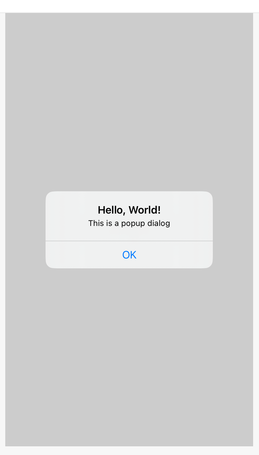
The Alert view takes a title, a message, and a dismissButton as parameters. The dismissButton can be a .default button, a .cancel button, or a .destructive button, and can have a handler block to respond to user selections.
When the popup is dismissed, the showPopup state variable is set to false, which removes the popup from the view hierarchy. You can use this variable to update the UI or perform any other actions based on the user's selection.
You can customize the appearance and behavior of the popup by adding additional buttons, text fields, or other controls to the Alert view, or by using a custom modal presentation style.